 Sam Rayner
 has published work on Ricardian poetry and she lectures on publishing. In her paper,
‘Publishing Heyer: Representing the Regency in Historical Romance,’ she explored the ways in which Heyer's novels have been marketed in the UK via their cover art and copy. As Rayner observed, Heyer herself "was never too busy to care about this aspect of her work" (Aiken Hodge 176). The paper was illustrated by a great many slides which, unfortunately, I cannot reproduce in full in this summary but I've included pictures of, and links to, some of the covers mentioned by Rayner.
Rayner began by looking at the recent
reissues by Arrow Books, which is part of Random House. The
cover of Cousin Kate shows part of Charles Haigh Wood's
Love Will Triumph. [LV comment - as far as I can tell, Haigh Wood was born in 1856 and died in 1927, so his paintings look back to the Regency period, rather than being contemporaneous with it.] These new paperback editions are in the larger "B" size.

Heyer herself was fond of the covers designed by Barbosa [LV comment: many of these can be seen
at the Georgette-Heyer.com website.] His style is clean, unfussy, and elegant, with the romantic elements not stressed. This perhaps reflects the fact that at this time Heyer's novels were not targeted particularly at a female readership. Heyer had many male readers, including many of her husband's legal colleagues. Rayner pointed out that on the Barbosa cover of
False Colours the female element is reduced to a stone sphinx.

When Pan acquired the paperback rights, however, their covers were very different. In fact, Rayner describes their colour choices as "lurid" and they had some rather sensational pictures. The early Pan cover of
Regency Buck, for example, depicts a fight scene and puts Judith Taverner into an extremely low-cut gown. Heyer had provided the backcover blurbs for many of the hardback editions of her novels but these were not adopted on the paperbacks. Instead the new blurbs focused on the aspects of "Adventure! Excitement! Romance!" which are promised on the front cover of
Regency Buck. It appears that these technicolor covers were drawing inspiration from the movies and movie posters of the period. Pan's house style was competing with Penguin in the paperback market, and with film which was an important leisure alternative to reading. Heyer herself objected to what she saw as marketing to the lowest common denominator of reader.


Pan later moved to a new template which featured a cameo of a scene from the novel. Strong fonts were used but the blurbs were reworked to make them less rumbustious. Later, curlicues were added around the cameos. In many of the cameos one can detect the influence of contemporary fashion, as in the hair and dress of the heroine on this cover of
The Reluctant Widow.
Penguin also published some paperback editions of Heyer's novels. Rayner showed us the cover of their

1966 edition of
False Colours, which is illustrated with a photo of a lady and gentleman.

They also published a Peacock edition of
Devil's Cub in 1963, which rather surprised the audience since this was an imprint for children. Penguin would appear not to have been entirely satisfied with the 1966 cover of
False Colours because a new edition appeared in 1967 with a geometric design. Rayner quoted again from Aiken Hodge's biography of Heyer:
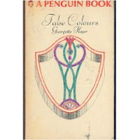 Penguin let her see the proposed new jacket for False Colours when they reprinted it in 1967 and she approved its abstract design without enthusiasm: 'I did suggest that it was a trifle dim, and would hardly strike people as being an advertisement for any book of mine. I was told that the firm was now adopting a policy of Quiet Elegance -! Also (rather loftily) that all my previous jackets had been on the vulgar side. You know, Max, I was lost in admiration of myself! I did NOT say, "Well, yours certainly was!"' (176)
In 1971 Penguin redesigned the cover once again.

Pan also overhauled its covers in the 1970s. Their new look featured pictures which Rayner describes as "inspid," "chocolate box" and "romantic" and she chose as an example their new version of the cover of
False Colours. [LV comment: they can all be found on
this page, where they have been collected by someone who considers John Rose's pictures "to be some of the most aesthetically pleasing and artistically satisfying covers ever to grace the covers of Heyer paperbacks."]

In the 1990s Arrow reissued the novels with small cameos featuring a portrait, set against an architectural background. These perhaps pick up on the earlier Pan use of cameos and Barbosa's use of Georgian architecture and they give the books a more literary feel.

The latest Arrow reissues [LV comment: which can be seen
here] are in the rather larger "B" size and the artwork extends over the whole of the cover. They are perhaps more romantic in tone, and (as in this example), there may be a focus on the feminine.
This style has inspired other publishers, including Sourcebooks, which are reprinting Heyer with covers that they describe as having a "Marie Antoinette" look [LV comment: they can be seen
here. I think it's perhaps also worth noting that Mills & Boon having been using a similar kind of artwork for the covers of their
Regency Lords and Ladies Collection and in fact, the
Sourcebooks cover of Regency Buck uses exactly the same painting,
Hearts are Trumps by George Goodwin Kilburne, as appears on the cover of
volume 4 of Mills & Boon's Regency Lords and Ladies collection. The
Arrow cover of Simon the Coldheart features
God Speed by Edmund Blair Leighton which,
as I mentioned a while ago, seems to have provided the inspiration for the Mills & Boon cover of Carol Townend's
An Honourable Rogue. In addition, the
Sourcebooks cover of False Colours features
Two Strings to her Bow by John Pettie and so does
Ann Herendeen's Phyllida and the Brotherhood of Philander, published by HarperCollins.
For those interested in seeing more of the early Heyer covers, many of them can be found
here and
here.]


