I was reminded of Mills & Boon's current "The Powerful and The Pure" mini-series when I saw the following call for papers, for a conference to be held in Dundee on the 8th and 9th of June:
Full details are available here. So, back to "The Powerful and The Pure." Kate Walker has written a novel for this mini-series which containsCall for Papers: Ninth Annual English Postgraduate Conference
High and Low: Cultural Levels in Word and Image
High and Low is the ninth annual Postgraduate Conference held by the English Programme, University of Dundee, and runs in conjunction with the Scottish Word and Image Group annual conference. It will address configurations of high and low in literature and visual media and is particularly interested in the perceived distinction between highbrow art and lowbrow entertainment, and the ways in which middlebrow texts, and other amalgamations of these two categories, are able to negotiate the apparent gulf between them. Of particular relevance to this dichotomy are texts that have been subject to critical re-evaluations over time, works that mix the sacred and the profane, and artistically sophisticated products of trash culture.
reworkings of classic romantic stories from literature. The other books in the series are by Sharon Kendrick - The Forbidden Innocent (Jane Eyre), Cathy Williams - In Want of A Wife? (Pride and Prejudice) and Kate Hewitt — Mr & Mischief (Emma) My own story is a reworking of one of my favourite novels of all time - Wuthering Heights — and it will be called The Return of The Stranger.Here's the cover of the first in the series (and hopefully I've copied the html properly, so that if you click on the cover, it'll take you to an excerpt):

Since the conference is interested in images as well as texts, here are some covers for Jane Eyre itself. All three come from Penguin's website: the first seems to me to position the novel as a "high" novel, the second looks as though it's trying to appeal to a different market segment (maybe Young Adult?), and the third cover is from a Signet edition.


Here's the cover of the Mills & Boon reworking of Pride and Prejudice alongside two covers for the original novel (the first is from Penguin, the second from Headline). The layout of the M&B cover and the Penguin one are rather similar, while the Headline version looks as though it's hoping to convince readers that Austen is chick lit.


Stirling University's The Gothic Imagination blog gives another example of interesting relationships between "high" and "low":
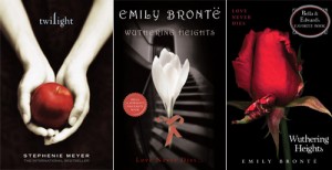
The Twilight books are vaguely inspired by 3 novels: Wuthering Heights, Pride and Prejudice, and Romeo and Juliet. You’ll no doubt have seen the Harper Collins reissue of Wuthering Heights in 2009. As well as being branded with the Twilight colours, Wuthering Heights is given its celebrity endorsement; it is, we are assured, ‘Bella and Edward’s favourite book’. There’s a quite fascinating process of framing going on here as a result of branding. Wuthering Heights, appropriated by Meyers in her series, is retrospectively reframed by that to which it gave issue, and constituted in a different way, for a different (and particular) readership.----
- Byron, Glennis. "©Branding and Gothic in Contemporary Popular Culture: the case of Twilight." The Gothic Imagination. December 31, 2010.

I am delighted to see attention being paid to the relationship between word and image. The perennial debate on cover-art is a rich source of ideas, and not only in fiction. Your examples, Laura, are very intriguing.
ReplyDeleteAt the same time, I have to sigh over the persistence of the traditional concept of 'high' and 'low'. I believe that this way of classifying literature and the visual arts is pernicious, since it applies arbitrary value-judgements to the intention, rather than only to the execution. Artistic inspiration or intent is subject to continual cultural change in a way that competence of execution is not, making it a very poor signifier of actual quality.
Interesting take on the subject. I can't say that I disagree with you.
ReplyDeleteTigress, I'm glad you found my examples intriguing. I have to admit that I don't automatically pay a lot of attention to images because I'm much better at remembering words, but every so often there are images which do grab my attention. Headline's "chick lit" covers for Austen did, as did the Twilight-themed Bronte cover, because they seemed to be such a clear example of attempted re-branding. When I came to write this post I couldn't actually remember which of the two Bronte covers I'd seen; I just knew that I'd seen a classic novel with a Twilight-inspired cover.
ReplyDeleteNow that I think about the connections between words and pictures a bit more, I've remembered that I recently read a post by Louise Allen, in which she described (and gives examples of) the way in which two of her historical novels for Mills & Boon have been converted into manga:
it was soon very clear that the manga version was incredibly true to the original book: I could follow it easily from the pictures and it all seems to be there.
I'm not sure that I entirely like the heroines with their huge eyes, but the heroes are to die for!